LET’S BE FWENDS ISSUE #66:
LANDING PAGES, A/B-TESTING, MORE MAPS AND THE WORLD’S UGLIEST COLOR
“For the things we have to learn before we can do them, we learn by doing them.” ~ Aristotle
Is the new landing page no landing page at all?
I’m pretty sure the answer to that question is “no”, but the point the author is making is a good one: When it comes to your product, talk less and show more. A couple of interesting questions that can kickstart your brain on a wednesday:
How easily can you let people try your product without any commitment? What would the most interesting outcome of your product people can experience immediately? And if all of that is not possible (because your product is too deeply embedded into a use case, or too complicated for a simple try-out), what would be a good demo?
A thing to consider about A/B-Testing

Matthew Ström has an intersting take on A/B-Testing, a cornerstone of modern digital design and product development. By combining two insights into decision making, he arrives at a conclusion that intuitively resonates.
The first insight is Fredkin’s Paradox: The more equally attractive two alternatives seem, the harder it can be to choose between them.
This makes the choice actually less meaningful, because it is less clear why I choose one thing over the other.
The other one is Parkinson’s Law: The effort spent discussing a decision will be inversely proportional to the value of making that decision.
With both together, Matthew hypothesises that most organisations using A/B-Tests most of the time test stuff that doesn’t really matter, using more and more elaborate testing and analytics frameworks for tests that mean less and less.
I’m not sure if I agree with him (and his post lacks all the data needed to agree or disagree), but it definitely is a nice metric to add to your decision making process:
“Will the net benefit of this A/B-Test outweight its cost?”
Bad map projections
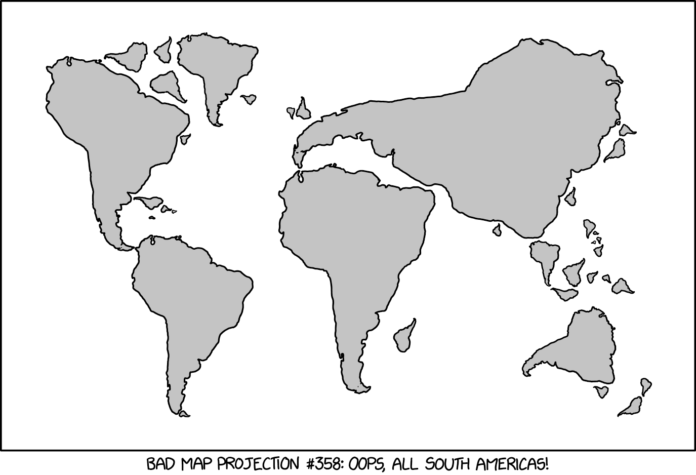
Don’t know if you’ve ever noticed that South America looks a lot like any other landmass on earth (or maybe it’s just another case of pareidolia on my side), but this makes a pretty good map of the earth. In any case, it’s not worse than the Mercantor-Projectionwhen it comes to understand the world. (Note: If you want to know how the world really looks like, look at the Peters Projection, or even better a globe).
How to sleep on a plane
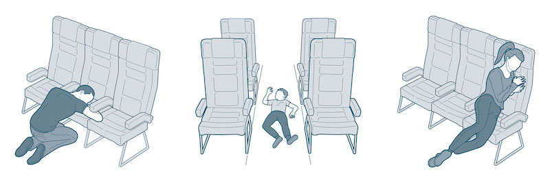
The only one that ever worked for me is the window thing.
Another one I tried but failed at is the one when you flop forward and rest your elbows on your thighs. I was told that this is called a “Fiakersitz” (after the viennese coachmen), but I couldn’t find anything about this on the interwebs. It should work because you can relax practically all of your body, but I couldn’t go to sleep like this.
The unofficial Apple archive
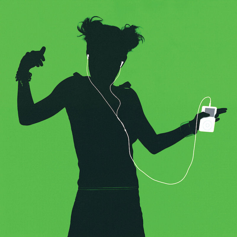
Finally, there is a comprehensive archive of all the designthat came out of 1 Infinity Loop, California. It’s not run or endorsed by Apple, so it’s the Unofficial Apple Archive, but people familiar with Apple tell me it’s pretty comprehensive. Featuring products, ads, keynotes and all kinds of communication materials. I recommend browsing it for a good flashback into computing history.
The Radiohead public library

And then there’s the very official Public Library created by Radiohead. It’s about time their corpus of work is accessible in one place, although accessible is a pretty big word to throw around in this context (I mean - it still is Radiohead after all).
Lots of Elements we’re using are already pretty scarce
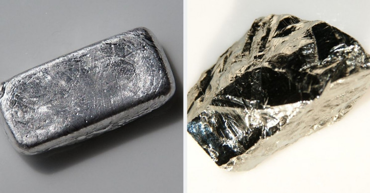
A well talked-about fact is that we’re running out of easily accessible oil and coal. But those are not the only resources we’re relying on that are becoming scarce. Here’s a list of some of the stuff we’re running out, and what it is used for. But maybe we can start making them out of plastic soon, just as we did with gold.
Can this program guess your name?
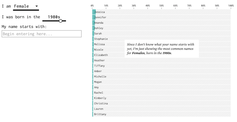
I’ve talked about the problem with “anonymized” things, being them your browser in incognito mode or datasets used for scientific research (mainly that they’re not half as anonymous as you’d think).
So, as an example of how powerful statistics are in guessing things, see if this program can guess your name based on your gender and date of birth. Caveat: This is based on US-data, so if your name doesn’t exist in english or its commonality is different in your country compared to the US, then this probably won’t work very well. But it did in my case.
The ugliest color in the world

When I read about the color that was chosen to be the ugliest color in the world, I thought: Well, probably a bit of an overstatement. Then I saw the image depicting the color and thought “Well, what an odd color for an image placehoder”. Then I realised that it wasn’t a placeholder, but that I was staring at the ugliest color in the world. Holy cow, that color is ugly! I mean: Just look at it. It’s really ugly. It is bland and revolting at the same time. How is that even possible?
If “Learning by Doing” sounds to you like “Training on the Job” then all I can say to you is: Welcome to adulthood. Ad-libbing it since forever. 🤷♂️
Subscribe to Let's be Fwends